The mark
There is no symbol. The name already is one.
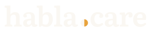
habla.care is a Spanish verb and an English noun joined by a dot. That dot is the mark: the place where the two languages meet, which is exactly what the product does. This page explains each decision, what was thrown out, and what was thrown out on measurement rather than taste.
The mark was just chosen and the site has not finished changing over to it. The header on this page, the tab icon, and the internal documents still carry the previous logo, which was a doorway. What follows is what it is changing to, not what is already everywhere.

Papel
Umbral 900
Element by element
There are four decisions: draw nothing, keep the dot, split it, and choose a typeface that reads instead of one that performs.
Why there is no picture
Almost every mental-health product draws a speech bubble and sets the name beside it. Here that would be redundant. "Habla" is already the instruction and "care" is already what follows; a picture on top would say the same thing twice. There is a more practical reason: the name is also the address people type. A logo you cannot type loses that, and on a poster taped to a wall that is the only thing that matters.
The dot
The dot separates the verb from the noun and joins them at the same time. It is the one place in the name where the two languages touch, and joining two languages is the whole of what the product does. That is why it carries the identity: take the dot away and you have two loose words; take everything else away and the meeting is still there. It is also the only thing there is to design when there is no symbol. The typeface is chosen; the dot is drawn.

Why it is split
One disc, two halves, one seam: teal on the habla side, gold on the care side. Two languages, one dot. The seam needs about 5 px of disc to exist, so below 24 px tall it is not used: a small version ships instead, with the dot in one solid color. It is not left to degrade on its own; the file changes. Splitting it also solves a real problem: on a light ground the gold is barely there, and the teal half never disappears, at any size. The size rule is further down, but the drawing already gets ahead of it.

There is a less pretty reason as well. With no symbol, the words are the mark, and "habla.care" set in any ordinary typeface is about the hardest thing there is to protect. A dot with a shape of its own is something a registration can hold onto. It is said here because it is part of why this one was chosen over the others, and leaving it out would not make it less true.
The typeface
Literata, a serif drawn for reading on bad screens and cheap paper. Ten families were compared, all set to the same x-height — two typefaces at the same point size look like two different sizes, and you would end up choosing on an illusion. Literata won because it has no hairlines to lose: the serifs are blunt, the x-height is large, and it holds together at the sizes where the other serifs start to fray.
The test was not a slide. It was a sticker on a bathroom stall door and a 16 px icon in a browser tab, which is how this product actually gets handed out. A serif that performs falls apart in both. This one reads in both.
The colors
Four colors do all the work, flat, no gradients. The fifth is kept out of the logo on purpose.
Umbral 900
#14524A
The ink. The letters, the left half of the dot, and the ground when the mark is reversed.
Luz
#E8A33D
The accent, and only on the .care side. Never on habla, and never for body text.
Papel
#FAF7F2
The light ground. Not white: paper, and it takes some of the glare off the screen.
Tinta
#24201C
The text you are reading. Not black, and it does not go in the logo.
The names come from the previous logo — umbral is the step at a doorway — and they stayed. Renaming five colors that are already in the code, in the files, and at the print shop would cost more than it would clear up.
The red that is not here
Auxilio is the red of the crisis screens. It is not used for errors, not for delete buttons, not for chart series, not for anything urgent that is not a crisis. And it is not in the logo. A logo appears on everything: the poster, the badge, the browser tab, the foot of an email, the sticker in the bathroom. A mark drawn in Auxilio would spend that reservation in all of those places at once, and by the time somebody saw it where it counts, they would have seen it a hundred times where it did not.
Auxilio
#C0503C
Reserved. Crisis screens only. Explained below.
A color kept back is a color that means something. Auxilio decorates nothing, sells nothing, and calls your attention to nothing else. When somebody sees it in the product, there is a line on the other side of it that answers 24 hours a day.
What was thrown out
There were ten directions and nine of them fell. Several did not fall on taste but on measurement: every mark was inspected at 16, 32, 48, and 128 px, magnified, pixel by pixel, on both grounds, in one ink, and through a hard threshold standing in for a photocopier. This is what killed each one.

The doorway
It was the previous logo: an arch you can walk through, with a person already out the other side. At 16 px the arch closes and what is left is a padlock. A product whose promise is that nobody sees what you tapped cannot carry a padlock in the browser tab; it says the opposite of what it does. It was redrawn square-topped and at that point it holds — the padlock read dies with the arch — but by then the other question was already on the table: if the name already says “come in and speak”, why draw it again?

The staircase
Three steps — what to say, who to say it to, what happens next — and a lit door at the top. In color it works. In one ink the door disappears completely, and it disappears for a reason worth saying out loud: it had been drawn as a gold shape sitting on top of the staircase, not as an opening cut out of the ink. A shape made of color dies when you take the color away; an opening does not. It had a second problem as well: steps mean effort, and this product exists to lower the step.

The mark that opens
Spanish is the only language that opens a question before it asks it. As a mark it was the best argument in the set: permission to ask, drawn. Two things took it down. At heavy weight the counter of the ¿ fills in, and at 16 px it is a blot. And to anyone who has never typed a ¿, the whole idea is invisible: they see a squiggle, or a 2. Half of this page is read in English.
The dot as a ring
With the dot chosen, its shape was still open: circle, rounded square, ring, or split. The ring was the prettiest idea — a place you stand in rather than a point — and it is the one that failed everywhere: at 16 px the hole is under a pixel, it fills in on a photocopier, and it closes up in embroidery. It would have been a variation that only works on a poster, and that is not a variation. The rounded square reads as a little square and stops reading as punctuation, and the moment it stops being punctuation it stops being a web address.
Four drawings were thrown away at the rendering stage rather than the taste stage: the arch that became a padlock, the ¿ that filled in, a four-piece quotation mark that turned to mush, and the staircase door that erased itself in one ink. None of the four looked bad large. That is the whole reason for testing small first.
How it was tested
Every version was seen at 16 and 32 px tall, at actual size, on Papel and on Umbral 900; in one ink; through a one-bit threshold standing in for a photocopier; and blurred, at the equivalent of a poster seen from three meters.
What was not tested, and somebody has to: a real embroidery stitch-out — the dot is the element at risk, and below about 6 mm a filled disc becomes a knot — a screen print at final size, a vinyl cut, a photocopy on a real machine rather than a digital threshold, and enamel pin tooling. Until that happens, what this page says about those processes is a forecast, not a measurement.
How to use it
These rules are written to be followed without having to ask anybody.
Clear space
Leave clear space of two dot diameters on all four sides. Measure it from the ink — from the lettering, not from the edge of the file, which carries a margin of its own. Nothing enters it: no text, no rule, no other organization’s logo, no edge of the page. The measure is tied to the dot on purpose: if the logo scales, the space scales with it, and there is no table to look up.
Minimum size
The full lockup with the split dot: 24 px tall, which is 113 px wide. Between 24 and 18 px use the small version, where the dot is one solid color. Below 18 px there is no full lockup. The square icon — the h and the dot, for the browser tab, the avatar, and the app icon — holds at 16 px, hand-drawn on that grid rather than scaled down to it. Below 16 px, use nothing.
Which version on which ground
On Papel or any light ground, the two-color version. On Umbral 900 or any dark ground, the reversed version: the gold has contrast to spare there and holds at any size. On a photograph, neither — put the mark on a solid block. For a stamp, embroidery, vinyl, screen printing, and photocopying, the single-ink version.
The Luz rule
Luz on Papel gives a contrast of 2.0 to 1: on a light ground the gold is barely there. But what fixes the size is not the contrast, it is the seam — a split disc needs about 5 px for each half to hold real color. So below 24 px tall the dot is not split. On a light ground it resolves to solid Umbral 900, which is the same drawing the stamp and the photocopy already need. On a dark ground it resolves to solid Luz: the gold gives 4.2 to 1 there and never was the problem. And this is not an accessibility argument — the lettering in a logo is not body text. It is that you cannot see it.
What not to do
Do not change the colors. The seam through the dot is vertical and through the center: it is never tilted. The halves are never swapped — ink on the habla side, gold on the .care side, always. The dot is a circle: not a ring, not a rounded square, not a teardrop. Do not stretch it, tilt it, shadow it, or set it inside a box or a circle. Do not redraw it in another typeface. And never draw it in Auxilio.
Downloads
Six files, all SVG: vector, with the lettering converted to outlines, so they draw the same without loading any typeface. Take the one that matches your ground and your process, and do not modify it. If your tool will not take an SVG, write to us before taking a picture of the screen.
Full lockup, light ground
The default. Site, document, slide, poster: anything on Papel or on white, at 24 px tall or larger. The file carries no ground of its own, so it lands on whatever letterhead you already have.
Full lockup, dark ground
On Umbral 900 or any dark ground. The one version where the gold holds at every size. It carries no ground of its own either: you supply the ground, and it has to be dark.

Full lockup, one ink
Stamp, embroidery, vinyl, screen print, photocopy. And light grounds below 24 px tall, under the Luz rule: it is the same drawing there. The dot is one solid color: it loses the seam and loses nothing else.
Square icon
The h and the dot, in a square. Browser tab, avatar, app icon, badge: anywhere there is no room across. Holds at 16 px, hand-drawn on that grid; at that size the dot is one solid color.

Square icon, dark ground
The same square, carrying its own Umbral 900 ground inside the file. This is the one for a dark bar, for a photograph, or for anywhere you do not know what will be behind it.

Square icon, one ink
For a pin, a stamp, embroidery, and anything printed in one color. It is also the correct version for a small light ground, under the Luz rule.
Who may use it
These files are here so a journalist, an allied organization, or whoever is printing posters can refer to habla.care without redrawing the mark. The logo identifies habla.care and nobody else: do not use it in a way that suggests your organization and HABLA are the same thing, or that HABLA has endorsed something it has not. If you need a lockup that pairs it with yours, that does not exist yet and has to be drawn. Write to us.